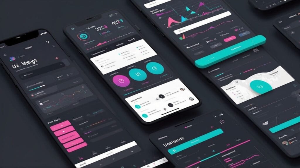
What are the Best Practices for Responsive Design in UI/UX Design in 2026?
Introduction
In the rapidly evolving world of technology, ensuring seamless user experiences across devices is no longer a luxury—it’s a necessity. As users interact with websites and apps on a variety of devices, responsive design has become a cornerstone of UI/UX design. In 2026, the principles of responsive design have advanced to address the growing complexity of user behavior, making it essential for designers to stay updated. This article explores the best practices for responsive design in UI/UX design, ensuring your projects are both future-proof and user-friendly.
Why is Responsive Design Important in UI/UX Design?
Responsive design ensures that digital products adapt fluidly to different screen sizes, resolutions, and orientations. The benefits include:
- Improved User Experience: Users can seamlessly navigate across devices without encountering broken layouts or functionality issues.
- Enhanced Accessibility: Responsive designs cater to diverse user needs, including those with disabilities.
- SEO Benefits: Search engines prioritize mobile-friendly and responsive websites, boosting rankings.
- Cost-Effectiveness: A single responsive design eliminates the need for multiple device-specific versions.
Best Practices for Responsive Design in 2026
1. Prioritize Mobile-First Design
The mobile-first approach remains a leading strategy in UI/UX design. By designing for smaller screens first and scaling up for larger devices, you ensure:
- Core functionality is accessible on mobile.
- Simplified and focused design elements.
- Faster load times and reduced bounce rates.
2. Utilize Fluid Grids and Flexible Layouts
Responsive designs depend on grids that scale proportionally. Key points include:
- Use percentages instead of fixed units for defining grid elements.
- Leverage CSS frameworks like Bootstrap or Tailwind CSS to create flexible layouts.
- Ensure elements align and resize harmoniously.
3. Implement Scalable Typography
Typography should adapt seamlessly to different screen sizes. Best practices:
- Use relative units like
emorremfor font sizes. - Establish a clear typographic hierarchy for readability.
- Test text readability on both small and large screens.
4. Leverage Media Queries
Media queries are indispensable for creating responsive designs. They allow you to:
- Target specific device widths and orientations.
- Apply tailored styles for different screen resolutions.
- Optimize elements for various viewing contexts.
Example:
@media (max-width: 768px) {
  body {
    font-size: 14px;
  }
}
5. Optimize Images and Media
Images and media significantly impact user experience and load times. Tips for optimization:
- Use modern formats like WebP for faster loading.
- Employ responsive image attributes such as
srcsetandsizes. - Test media on high-density screens to ensure clarity.
6. Focus on Touch-Friendly Interfaces
With touchscreens dominating device usage, designs must be:
- Touch-friendly with sufficient spacing for tappable elements.
- Optimized for gestures like swiping, pinching, and dragging.
- Free from overlapping or cluttered interactive areas.
7. Incorporate Testing Across Devices
Thorough testing ensures designs perform consistently. Steps include:
- Use tools like BrowserStack or LambdaTest to simulate multiple devices.
- Conduct usability testing to gather real user feedback.
- Regularly update designs based on emerging device trends.
Additional Strategies for Responsive Design Success
- Focus on Accessibility: Integrate ARIA labels and adhere to WCAG standards.
- Minimize Load Times: Optimize code, compress assets, and use lazy loading.
- Adopt Progressive Enhancement: Deliver core functionality first and enrich it for advanced browsers.
- Stay Updated: Follow design blogs and participate in UX communities to learn about new trends.
Conclusion
Responsive design is the backbone of effective UI/UX design in 2026. By prioritizing mobile-first strategies, leveraging flexible layouts, and focusing on user needs, designers can create adaptive and engaging experiences. As technology continues to advance, staying committed to these best practices will ensure your designs remain competitive and impactful. Start implementing these strategies today to elevate your design game and meet the demands of the modern digital landscape.


